Infographic: 10 Things You Need To Know To Build a Chinese Website
A picture is worth a thousand words
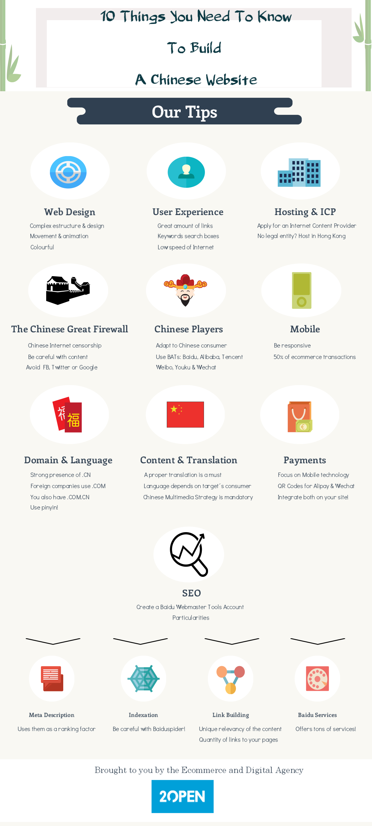
After the great success achieved by our two articles 10 Things You Need To Know To Build a Chinese Website (I) (II), in the team we have thought it would be a good idea to summarize and turn them into an infographic.
We hope you enjoy it as much as we enjoyed its elaboration 🙂
Are you looking for a digital marketing and ecommerce agency?
Visit us. Let´s have a talk!
10 things you need to know to Build a Chinese Website (Part 1)
When planning to enter the Chinese market, one of the main points in every marketing plan should be the creation of a website that focuses on the Chinese consumer.
Naturally, there are some questions that come to mind…
- What are the differences between a western and an eastern website?
- What are the aspects that I have to keep in mind in order to trying to attract Chinese consumers?
- Would it be a good idea to just duplicate and translate my current content?
All of the above can be summarised in one question; what do I need to do in order to create a great website that will have the potential to reach the 675 million China internet users?
In this series of posts, we will try to give you some tips that will help you create a website for the Chinese market that will appeal to Chinese consumers and also match the style, tech and literary attributes of eastern consumers.
1 – Chinese Web Design – What the …???
When we look at a Chinese website, the first feeling we get is confusion… Language, structure, content … We can´t find anything similar to Western websites based (lately) on cleanliness and simplicity. Our China web design must be adapted not to our tastes, it must match Chinese consumer design taste.
If you have not navigated through Chinese websites maybe you don´t completrly understand what I mean. You´ll see easily the difference with these two examples. Taobao and Ebay, two B2C marketplaces (or C2C) from east and west.
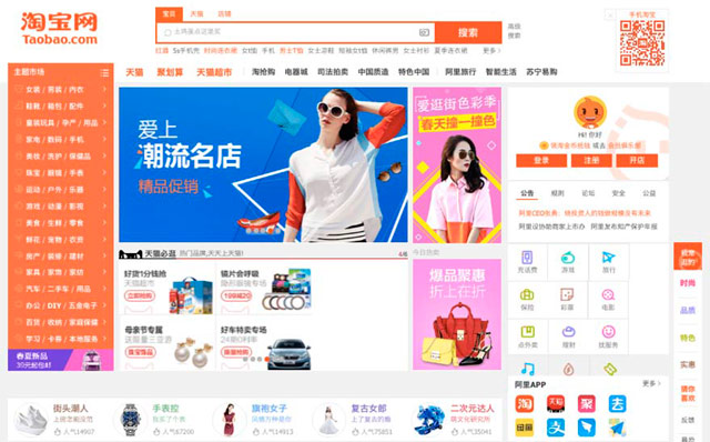
China Web Design Example – Taobao Home Page
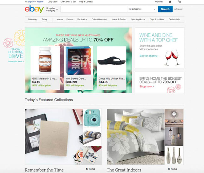
Western Web Design Example – Ebay Home Page
Can you appreciate the difference in style, design, structure? I bet you do…
We can see a lot of information on Chinese site in contrast to the cleanliness and simplicity of the western site.
Our experience creating websites for the Chinese market has shown us some key points to understand and get advantage:
- Chinese websites use many more elements and are much more colorful than Western.
- Chinese language is different. It seems obvious… but there are things we have to consider about Chinese language such as:
- There is not a capital letter in Chinese
- There are no spaces between characters
- Chinese characters are far more dense than our letters
- Chinese sites use a lot of animation, flashing texts and banners. This is clearly the opposite to our western websites where movement is disappearing. The reason can be it’s much harder to grab attention using fonts in Chinese than it is with western languages.
2 – User experience… Do they have any good one?
We have just seen as websites in China seem much more complex than we are used to. We might think that the user experience will be a nightmare, but Chinese user is so accustomed to information under this structure as we are to the western structure.
Chinese user is concerned about usability and user experience, but is used to webpages so busy usually does not care how the site looks. However the trend is towards simplicity and clarity on web pages. In a more European style.
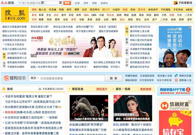
Where is (link) Wally?
Some of the highlights on Chinese websites regarding to navigation are:
- Chinese websites have a big number of links, however Chinese users do not like this system. This can be given by the low load speed internet in China.
- All this links use to open in other new windows. Why? Again it’s mainly an issue of speed. Internet access in China is generally slow, users have gotten used to opening new links while waiting for a page to load.
- Keyword search box as a navigate tool. Link system is not comfortable for users because they can be lost due to the big amount of links. For this reason, on Chinese websites keyword searches have to be really efficient, and the search bar must be top accessible.
3 – Hosting & ICP. DIstance matterS
The one who said that, in internet there is no distance, did not know about China. If you are not (legal and/or physical) in Mainland China, easy staff like finding the right hosting can became a little bit more complicated.
Let´s start from the beginning, one of the most common questions when we are going to create a China site is should we host our website within or outside China? Is there is a big difference? The answer is very clear, as far as possible we should try host the web in Chinese Mainland, and we will try to explain why.
China network structure is not the best, which makes the websites loading speed not the most appropriate. By hosting our web outside China this problem becomes much more serious.
Okay, so we are clear, we should host our website in China, now what? We must apply for a number of ICP (Internet Content Provider) to the Ministry of Industry and Information Technology of China. This is the ICP license that will allow our site to stay in Mainland China. Only companies with a physical presence in China can apply for this license (which usually see in the footer of the sites, as in our case).
For companies that do not have a legal entity in China, we do recommend looking for hosting solutions in Hong Kong, which can limit the problem of loading speed and make our site more accessible for the Chinese user.
Now that we talk about speed, even though the main problem affecting the same be the hosting (inside or outside) there are also other factors that can make our web go slower (and we have seen that it is a key point in China) as can be:
• Website images are not size optimized
• Poorly code in our website
• Low hosting quality (even inside Mainland China)
• Our site is using services blocked in China (Google Fonts, Google Maps, Twitter, Facebook, etc…) which prevents the page from loading
4 – Did you say… services blocked? … the Chinese Great Firewall
China not only has a huge physical walls to defend themselves (in the past). China also has a large digital wall, the Great Firewall. Originally known “Golden Shield Project” but ironically nicknamed Great Firewall, it is a censorship and surveillance project initiated by the Chinese Ministry of Public Security in 2003.
This project acts as a digital censor and block all websites that do not meet the content requirements that marks the Chinese government.
Here you can see some more information about how the censorship works.
Among other things, Chinese Internet censorship censored webpages that have content that include; news sources cover topics considered that are defamatory against China: such as police brutality, Tiananmen Square protests of 1989, freedom of speech, Taiwan Government, Dalai Lama or the Tibet Independence Movement International …
These sites are banned or are indexed to a lesser degree, if at all, by some Chinese search engines and have significant impact on search results.
As a result of this control in China they are blocked pages as usual for us as Google, Twitter or Facebook (it does no matter how much Mark go jogging in Tiananmen). Although great firewall control is easy to jump (using a VPN, for example) the difficulty of accessing these pages has made their use and popularity is low.

Stop laughing Mark. It´s not gonna happen
This means we need to be very careful with our website content, try to be sure to avoid Great Firewall content restrictions and not to use third party banned platforms like Google (Google Maps, Google Fonts), Facebook or Twitter.
5 – New Players & New Rules
So, no Facebook or twitter, how am I going to promote my website? China has a digital ecosystem different of everything we are use to. Surely you’re wondering how you survive without some of the usual promotional tools. Natural positioning in Google, PPC Adwords campaigns, promotion of content on social networks like Facebook or Twitter …
In China you will find new players who have occupied these gaps and in some cases, created new niches. These new players have taken advantage of the absence of foreign competition (Facebook, Google …), its adaptation to Chinese culture and peculiarity and in some cases even a strong government support.
These actors we found some “copycat“, certified copies of known systems, such as:
- Baidu, the Chinese search engine par excellence (suspiciously similar to Google)
- Weibo, the microblogging service (suspiiiiciouuusssslyyy similar to Twitter)
- Youku, video service (guess who it is similar?)
We also have WeChat, the jewel of the crown and the mobile app (almost an OS) that includes messaging, payments, calls, moments … and which we discussed in detail in another post.
For our website to be inside China digital life it must be adapted to the rules of these actors, common in the dailylife of the Chinese consumer.
So, who are the big guys that you need to be friend of?
As soldiers in a war, most of these tools fall into three large “armies”. These three groups are known as the BAT and are in constant battle to dominate the Chinese digital ecosystem.
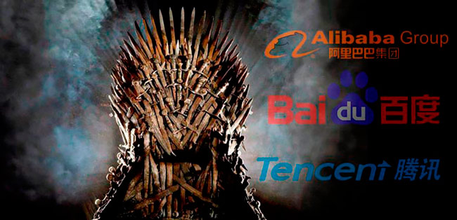
Who is going to win this war?
In short, Baidu holds commanding market share over search. Alibaba holds to the same power over e-commerce. Tencent is the dominant player in social media. But they are constantly trying to invade their territory, in a very interesting war for any fan marketing.
One of the commonalities of the BAT is a full support of the government, together with its dominant position in the market, makes this status quo is difficult to change.
What does it means for our website? We need to adapt our communication to this new players, generating our social media activity through Wechat, optimizing our SEO for Baidu or 360, uploading our videos in Youku, adding sharing actions in our content with Chinese social platforms… anything we use to do in our occidental site does not help us here and can be even negative for our goals. As we have seen, if we keep on using tools like Facebook (post sharing options for example) we can be blocked by the Great Firewall.
Do you want to know more? Sure? CHECK THE SECOND PART OF THIS POST HERE
References:
http://www.china-briefing.com/news/2015/05/22/best-practices-launching-china-website.html
https://econsultancy.com/blog/67466-why-do-chinese-websites-look-so-busy/
http://www.latmultilingual.com/build-localized-chinese-website/
Sources:
http://www.freepik.com/free-vector/screen-with-a-website-and-icons_847180.htm
http://www.freepik.es/vector-gratis/trabajador-llorando_834598.htm
All you need for your Chinese Landing Page
Landing pages have become more and more relevant over the past few years. With an increase in brand awareness and persuading power, they play a huge roll when it comes to online marketing and ecommerce. This article will focus on the basic structure of a successful landing page as the improvements that can be made to achieve better results.
What is a landing page?
Landing pages are often called guide pages, in general terms, a landing page is the first page that appears when a user enters a website, this could be either the homepage, product page, about us page etc. The channels through which the user enters the website are in most cases clicks on advertisements or results or search engines. There are a few things a landing page has to achieve and although it depends on its business scope, their aims can be simplified in the following way:
-Invite users to keep visiting
-Lead users to make a purchase
-Get users’ personal information
-Invite users to share or to comment
-Other activities, which can bring interactions, etc.
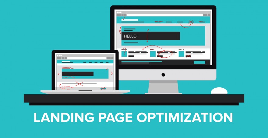
What does a landing page consist of?
Usually a landing page consists on 4 main parts:
- USP (Unique Selling Proposition)
- Core media
- Detail explanation
- CTA (Call-To-Action)
- USP (Unique Selling Proposition)
This is what we call “selling point”. In China, a lot of companies consider this as their core competence. It is a way of distinguishing yourself from other competitors; this is where a company presents its most attractive features about the products or the services it provides. It should basically answer the question: Why should consumers hire my services or purchase my products instead of the others in the market?The main headline of the landing page is also of great importance. It should be a sentence that explains your USP and it should attract the users’ attention. It is basically the first thing users read when they arrive in your landing page so therefore it must be concise and catchy.
- Core media
Media has been used to enrich a landing page, making a page more attractive through the use of pictures and videos or animations.When people are watching a webpage, an interesting picture or video can leave a better impression than a sentence.
- Detail explanation
This is a main part of your landing page. Here you need to put more detailed information to support your USP. It could be points that further explain in a more detailed way the main value proposition of your service or product. It could also include advantages of what your are providing the customer as well as useful real life examples that will continue to support your USP.

- CTA (Call-To-Action)
This is the deal-sealing part of your landing page. It should not be difficult for a customer to complete the purchase of the service or product at any given moment whilst he/she is viewing your landing page. It does not matter if it is a button, a link, or a form; you just have to make sure that it is obvious and eye-catching. Users must know exactly what they are doing on your webpage and all the relevant information that comes with it, both monetarily and logistically.
To sum up
We might take for granted the elements of landing pages, consumers do not really notice all of the work that has been put into a webpage, but as long as you would like to have a successful one, you should pay better attention to these details and think on creative ways to improve them. Nobody starts from the top, so why not give it a try and see how a good landing page can benefit your business?
If you have any questions or require any information about our services, please do not hesitate in contacting us, our group of specialists will happily assist you.
This article was edited by Andres Arroyo Olson from 2Open.
References:

