Landing pages have become more and more relevant over the past few years. With an increase in brand awareness and persuading power, they play a huge roll when it comes to online marketing and ecommerce. This article will focus on the basic structure of a successful landing page as the improvements that can be made to achieve better results.
What is a landing page?
Landing pages are often called guide pages, in general terms, a landing page is the first page that appears when a user enters a website, this could be either the homepage, product page, about us page etc. The channels through which the user enters the website are in most cases clicks on advertisements or results or search engines. There are a few things a landing page has to achieve and although it depends on its business scope, their aims can be simplified in the following way:
-Invite users to keep visiting
-Lead users to make a purchase
-Get users’ personal information
-Invite users to share or to comment
-Other activities, which can bring interactions, etc.
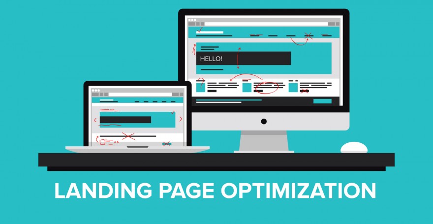
What does a landing page consist of?
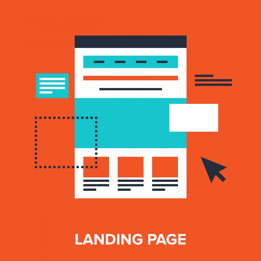
Usually a landing page consists on 4 main parts:
- USP (Unique Selling Proposition)
- Core media
- Detail explanation
- CTA (Call-To-Action)
- USP (Unique Selling Proposition)
This is what we call “selling point”. In China, a lot of companies consider this as their core competence. It is a way of distinguishing yourself from other competitors; this is where a company presents its most attractive features about the products or the services it provides. It should basically answer the question: Why should consumers hire my services or purchase my products instead of the others in the market?The main headline of the landing page is also of great importance. It should be a sentence that explains your USP and it should attract the users’ attention. It is basically the first thing users read when they arrive in your landing page so therefore it must be concise and catchy.
- Core media
Media has been used to enrich a landing page, making a page more attractive through the use of pictures and videos or animations.When people are watching a webpage, an interesting picture or video can leave a better impression than a sentence.
- Detail explanation
This is a main part of your landing page. Here you need to put more detailed information to support your USP. It could be points that further explain in a more detailed way the main value proposition of your service or product. It could also include advantages of what your are providing the customer as well as useful real life examples that will continue to support your USP.
- CTA (Call-To-Action)
This is the deal-sealing part of your landing page. It should not be difficult for a customer to complete the purchase of the service or product at any given moment whilst he/she is viewing your landing page. It does not matter if it is a button, a link, or a form; you just have to make sure that it is obvious and eye-catching. Users must know exactly what they are doing on your webpage and all the relevant information that comes with it, both monetarily and logistically.
To sum up
We might take for granted the elements of landing pages, consumers do not really notice all of the work that has been put into a webpage, but as long as you would like to have a successful one, you should pay better attention to these details and think on creative ways to improve them. Nobody starts from the top, so why not give it a try and see how a good landing page can benefit your business?
If you have any questions or require any information about our services, please do not hesitate in contacting us, our group of specialists will happily assist you.
This article was edited by Andres Arroyo Olson from 2Open.
References:
